We understand the importance of a well-designed website for consignment shop owners. It's not just about aesthetics; it's about functionality and creating an engaging experience for your customers. The thought of a major website overhaul can be overwhelming, but don’t worry. Even minor tweaks can make a big difference in how customers interact with your site.
Here are seven tips to help you easily improve your consignment shop website.

1. Respect the Fold with a Clear CTA
The "fold" is a critical aspect of website design. It is the part of your website that is immediately visible when viewers arrive without needing to scroll. If they have to scroll down to read more information, then they are looking “below the fold.”
Placing your call-to-action (CTA) prominently in this area is essential if you want to see conversions. Think of CTAs as friendly nudges that guide your visitors toward taking specific actions like adding an item to their cart, going to checkout, or signing up for your newsletter. Remember, most visitors (~80%) never scroll below the fold, so make it count.
2. Remove Clutter
Nowadays, users have limited attention spans. User experience data and market research conducted by the Neilson Normal Group have demonstrated that companies have a maximum of 10 seconds to grab a customer’s attention. Therefore, you need to remove the extra clutter to improve your website's effectiveness. Please don't feel pressured to fill every bit of white space with text; giving your content room to breathe with plenty of white space can actually make it more appealing. Visitors should be able to find the information they need within seconds of landing on your site.
3. Create a Powerful Logo
Your logo is the cornerstone of your brand identity. A professional logo adds credibility and sets you apart from others. Place your logo in the upper left corner of your website and link it back to your homepage so that as shoppers navigate the site, they always know how to get back to the beginning.
4. Use High-Quality Images
Invest in high-quality images of your merchandise. Photos of your merchandise are what sell the product or drive customers in. Clear, captivating images are essential for showcasing your products and enticing customers. Consider hiring a professional photographer or utilizing tools like PicMonkey to enhance your photos and make them visually appealing. Painted Tree Boutique is a great example of a store that leverages high-quality images across its site.
5. Create Fresh Content
Just as you regularly update your store displays, you should keep your website's content fresh and engaging. By updating it regularly, you can keep your content fresh and interesting. Regularly adding new content to your homepage demonstrates that your shop is current and aligned with the latest fashion trends and design aesthetics. Remember that high-quality content answers your audience’s questions and will boost SEO and keep visitors coming back.
5. Clean, Easy to Use Navigation
Navigation refers to how visitors move through your site. Think of your website like an inviting store layout—clean, modern, and easy to find what you need. The more options you give, the more confused customers get, meaning less they will view and ultimately purchase. Limit the number of menu options and maintain consistency in colors and typefaces throughout your site. Clear navigation guides visitors to the desired actions, such as browsing products or contacting your shop.
And don’t forget about accessibility! Ensure your website is user-friendly for everyone, including those with disabilities, by using alt text for images, ensuring good color contrast, and providing keyboard navigation options.
5. Mobile Optimization
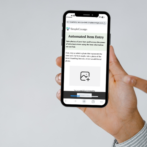
Most people browse the web on their smartphones, so it’s super important that your website looks and performs well on mobile devices. To ensure your site is mobile-friendly, test how it works on different devices and screen sizes. Tools like Google PageSpeed Insights can help you spot and fix any performance issues, making sure your site loads quickly on mobile devices. This way, no matter how your customers visit your site, they’ll always have a smooth and enjoyable experience.
Implementing these tips will improve the overall look and feel of your consignment shop website, enhance user experience, and ultimately drive sales. These small changes can make a significant difference in achieving that goal.
Ready to talk to sales?
Schedule a personalized 1-1 demo today!


